 This week’s feature, Invasion of the Body Snatchers, has long been regarded as a political hot potato. Like High Noon, it’s either a preachment for vigilance in the face of a Communistic menace or a cautionary allegory of a conformist overreaction to that selfsame menace. But for a certain kind of cinephile, the aspect ratio of Invasion of the Body Snatchers is just as contested as its ideological underpinnings. Moviegoers shouldn’t be passive pods for received wisdom, so we thought it would be edifying to discuss the context of theatrical exhibitions in the 1950s and beyond. – Eds.
The shape and configuration of theatrical film has been basically unchanged since the earliest days of the twentieth century—35mm in width, four uniform perforations per frame. The relative apportionment of image and sound within that frame has changed tremendously, however, and projectionists have long been expected to extract images of all shapes and sizes from the same old film strip. Through a combination of specialized lenses, lens attachments, aperture plates, and screen masking, they present a range of rectangular images known in industry parlance as aspect ratios.
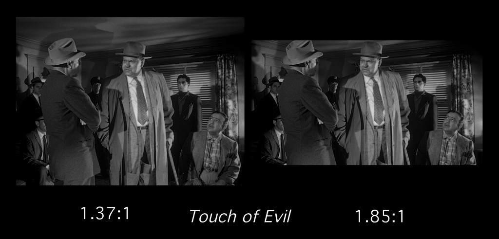
These shapes are expressed in numeric terms, as a ratio of image width to image height. The common aspect ratio 1.37:1, for example, means that the image on screen is 1.37 times wider than it is high. Counterintuitively, many of the wider aspect ratios like 1.85:1 achieve this apparent horizontal superiority simply by artificially constricting the height of the frame; since we’re talking in ratios rather than absolutes, cropping the top and bottom from the frame does yield a wider image, albeit with some loss of clarity when blown up on an enormous theater screen. The ultra-wide Cinemascope—2.39:1—uses a two-piece lens to anamorphically stretch a heavily compressed image on a conventional film strip.
Did scholars and fans talk about these things in any detail before the internet? Film history textbook discussions of aspect ratios were often limited to perfunctory descriptions of Hollywood’s competition with television in the early 1950s, with the enduring Cinemascope ratio treated in the same paragraph as the relatively short-lived ‘gimmicks’ like Cinerama and 3-D.
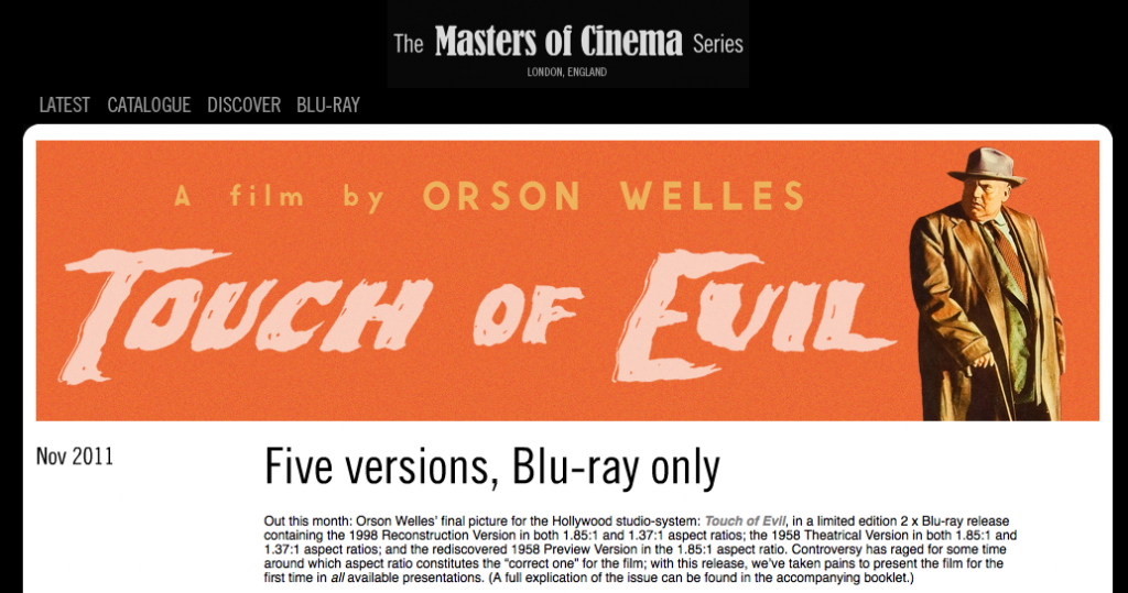
Things have changed, but not necessarily for the better. These days, aspect ratio debates tend to provoke passion and bad manners in equal measure. Fan fervor was immediately evident a decade ago when Warner Brothers decided to release a clutch of Stanley Kubrick films in 1.37:1 on DVD, on the controversial principle that the director favored open-matte presentations over letterboxing. (Ironically, there was almost equal consternation when the same studio later released the same films in 1.78:1 transfers on Blu-ray.) Debates raged over Criterion’s 2:1 rendering of Douglas Sirk’s Magnificent Obsession and Universal’s 1.85:1 cropping of Touch of Evil. The exception that proves the rule: not to be undone, the British imprint Masters of Cinema recently and hysterically released a two-disc Blu-ray edition with the Welles picture in five possible configurations, ranging from an open-matte, 1.37:1 rendering of the original theatrical release version to a 1.85:1 transfer of the 1998 reconstruction that approximated the cut outlined by Welles in a 58-page memorandum. (The Masters of Cinema team wanted to include a sixth iteration, but found the transfer supplied to be inadequate.)
In some sense, it’s only natural that home video releases stir such feelings. DVD and Blu-ray versions tend to fix a film in time and space; the image is immune from the scratching and cinching that occasionally afflict film prints, but it’s also removed from the realm of interpretation and manipulation available to the projectionist or archivist. There’s no adjusting the focus or framing after a studio QC tech has ruled the matter closed. Magnificent Obsession is either 1.37:1 or 2:1, but not both. (The recent vogue for 16:9 HDTV sets, which approximate fairly closely the 1.85:1 theatrical ratio, often dictates the ultimate answer, just as decades of 4:3 sets once assured a very different outcome, with the left and right edges panned-and-scanned away for cropped consumption.) For asset managers and telecine operators alike, the question of the proper aspect ratio can yield but one valid answer.
Long-time fans often dispute this answer. They recall television broadcasts or 16mm prints seen in decades-old campus film society screenings and the widescreen versions simply contradict the emotional and aesthetic unity they found in these open-matte prints. Trade papers and studio records may dictate a wide aspect ratio for a given film, but the fan holds onto details at the far reaches of the frame that look artistically indisputable. In some sense, this is the ultimate form of auteurism: the director intended things that the entire motion picture industry, from mogul on down to projectionist, conspired to cover-up. The great auteurs defiantly went about their business anyway. (Incidentally: if you ever do watch Touch of Evil in 1.37:1, notice, for example, the way the shadows seem to dance on the ceiling in some shots, a baroque extension of Welles’s and DP Russell Metty’s claustrophobic design.)
What’s the right answer? We can argue about intent all day, but whose intent matters here in the first place? Is it what the studio dictated in their press book or what the lab printed in the leader? Is it what the director wanted on screen or what the cinematographer saw in the viewfinder? And what if that intent is deliberately confused or clouded? Famously, Paramount produced Shane in 1.37:1, but released it with a suggested ratio of 1.66:1 at the dawn of the widescreen era, fearful that its backlog product would look antiquated in wider pastures.
 Rather than jockey for the ‘correct’ aspect ratio for a given film, we should respect the multiplicity of possible answers suggested by material circumstances of the exhibition sector. During the transition to widescreen and again today in the waning days of the multiplex, the intended ratio (whether conjectured, intuited, or proven on paper) often ran up against the constraints imposed upon (and often by) the exhibitor. In the tumultuous year of 1953, studios weighed and hedged against various technological innovations (widescreen, 3-D, curved screens, magnetic sound, etc.) and announced new in-house aspect ratios before the autumn unveiling of Fox’s The Robe in Cinemascope and high-fidelity, four-track surround sound. (For more about this period, see John Belton’s detailed account in the long out-of-print Widescreen Cinema.)
Until the Society of Motion Picture and Television Engineers standarized non-anamorphic American productions to 1.85:1, the studios released product in a variety of ratios. RKO and Paramount preferred 1.66:1. Disney and United Artists suggested 1.75:1. Columbia and Warner Brothers put out 1.85:1 product. Universal-International released 2:1. These prints often looked identical to the naked eye, with the different ratios being entirely dependent on the proper lens and aperture plates for the projector. Surely these ratios prevailed at studio screening rooms but were these dictates respected anywhere else? Cinemascope was itself an expensive proposition, with many showmen balking at the high cost of equipping a theater for magnetic sound, as Jack Theakston has discussed. Did exhibitors, historically disinclined to spend a cent more than necessary to get an image on screen, invest in equipment for all these variant ratios, especially when the anamorphic Cinemascope was the only one that carried any name recognition with the public? (Paramount allowed its VistaVision prints to be shown at a number of different ratios, as the conceit of the brand had more to do with high-quality origination on an enlarged camera negative than with the final shape on screen. Anyone who’s seen an original 35mm IB Technicolor print from VistaVision elements will likely agree with Paramount’s reasoning.)
Aside from the investment in lenses, plates, and masking controls for these competing widescreen ratios, what of the inherent limitations of theater architecture? Whether working in former legitimate houses or purpose-built cinemas, the exact ratio on screen was often determined by relatively pedestrian factors like the throw distance between the projectors and the screen, the focal lengths of available lenses, the shape of the proscenium, the constraint of the curtain, and the pictorial sensibility (or lack thereof) on the part of the management. In other words, 1.66:1 was never quite 1.66:1 anyway. And cinematographers expected this fluctuation, exposing a camera negative that could yield a satisfactory print at a variety of almost-there ratios.
In the multiplexes of the 1980s and 1990s, built in shopping malls with no real connection to the material history of film exhibition, the projection booth was often only equipped with two lenses: 1.85:1 and 2.39:1. Exhibiting films from the first half-century of cinema was a simple impossibility, unless one opted to crop away a substantial portion of the 1.37:1 frame. When studios released re-issues, they either ignored this issue entirely or optically reduced the original frame to fit within the narrow height of its latter-day relative. As with the imagined auteurs of the past, some filmmakers like Gus van Sant and Kelly Reichardt released films for 1.37:1 projection, modern exhibition practices be damned. Jean-Luc Godard made 1.37:1 films that he himself disclaimed as such.
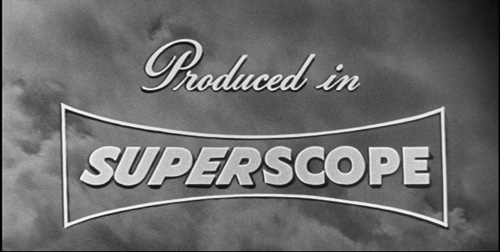
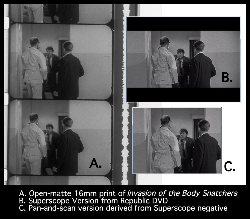
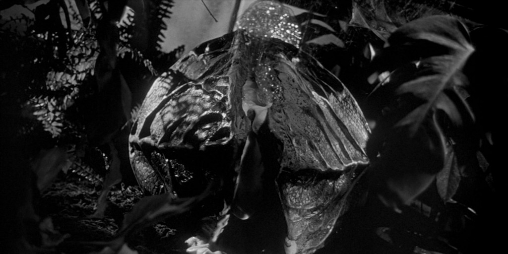
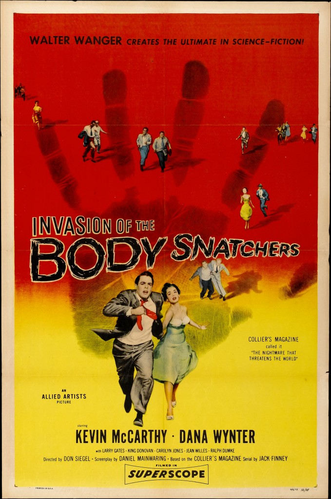
In other cases, the availability of a film in its correct aspect ratio is unduly influenced by the vagaries of survival and preservation. Don Siegel’s Invasion of the Body Snatchers was photographed in a standard, open-matte version, with the probable assumption that it would be screened theatrically in 1.85:1. Between production and release, however, Allied Artists decided to modify the film for SuperScope release. The SuperScope system boasted a 2:1 aspect ratio but, confusingly, achieved this shape in a manner very differently than Universal had. The flat negative was optically adjusted in the lab to produce cropped intermediate elements and release prints with a prominent squeeze. The image would be stretched out again in projection with a Scope-like lens. (Strictly speaking, the whole idea behind SuperScope involved producing a Cinemascopesque image without paying any royalties to Fox.) What resulted was a moderately wider image with substantially reduced quality owing to the optical adjustments in the pre-print stage.
The original, unstretched camera negative for Invasion of the Body Snatchers is lost and any attempt to produce a quality 35mm print or digital version must make do with the Superscoped elements that have come down to us. The only way to get a glimpse of the original is to look at vintage 16mm prints produced from the flat negative before its disappearance or destruction. (To approximate Siegel and DP Ellsworth Fredericks’s intended compositions from the open-matte 16mm print, one would need a specially-cut small gauge 1.85:1 aperture plate—but what hardcore collector and basement showman doesn’t already have one?) Either iteration is surely more pleasing than the early video transfers, which sliced the already-cropped Superscope frame to miniscule, incomprehensible proportions.
It’s fitting that one of the great, volatile classics of American cinema cannot be wholly contained or represented in a single print. We would be better off celebrating this abundance of expression and meaning rather than arguing about it.
The Northwest Chicago Film Society will be screening a restored 35mm Superscope print of Invasion of the Body Snatchers this Thursday at the Portage Theater. Please see our current calendar for more information. Special thanks to Judy Nicaud at Paramount Classics.

